- Solve real problems with our hands-on interface
- Progress from basic puts and calls to advanced strategies
Interactive Options Course
Posted May 20, 2025 at 9:28 am
1/ Why do they call them “Bull” markets and “Bear” markets?
2/ 200-day moving average (200MA)
3/ Inverse Traffic Light
Investopedia is partnering with CMT Association on this newsletter. The contents of this newsletter are for informational and educational purposes only, however, and do not constitute investing advice. The guest authors, which may sell research to investors, and may trade or hold positions in securities mentioned herein do not represent the views of CMT Association or Investopedia. Please consult a financial advisor for investment recommendations and services.
Why do they call them “Bull” markets and “Bear” markets?
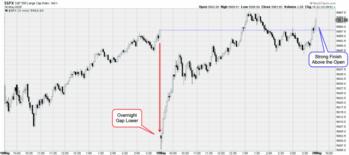
One of the signs that we’re in a good or bad market can be seen on the daily charts…
It is said that, when the stock market opens strong, but finishes weak, this is evidence that we’re in a weak, unhealthy bear market. On the other hand, when the stock market opens weak, but finishes strong, this is evidence we’re in a healthy bull market.
Why do they call them “Bull” markets and “Bear” markets? Well… because bulls attack with their horns from the bottom-up, and bears attack with their claws from the top-down!
The chart below shows the price action after Moody’s downgraded the U.S. credit rating. As you can clearly see, the market gapped down big (it doesn’t get much weaker than that!).
Then buyers stepped in, pushing up prices thru midday, followed by an intra-day pullback that had the market dancing around its open, only to see buyers take control at the end of the day, pushing the S&P500 to close positive on the day.
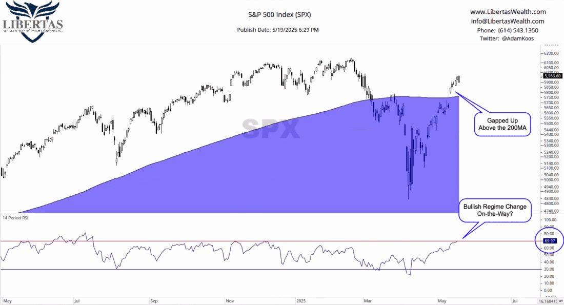
200-day moving average (200MA)
Another way to tell how healthy the stock market is – but this time, on a longer-term timeframe – is to observe:
Moving averages are a way of smoothing out the choppy, shorter-term swings over a period of time – and you can pick any time period you want.
For instance, below, I used a 200-day moving average (200MA) – and I used a blue shaded area because, whenever the market (or an investment) is below certain moving averages, I like to use the analogy that it’s “below water,” and investments, much like humans, can spend a short period of time below water before they start drowning!
However, observing the market today, it’s most certainly “above water.” In fact, it gapped up (i.e., it opened much higher in the morning after a lower, previous day close), above its 200MA, and has continued to follow through over the last five days.
Then, in the lower pane, you can see a momentum indicator called RSI (Relative Strength Index), and in this case, I’m using a 14-day RSI, which means it has a 14-day look-back period.
RSI shows us whether the bulls or bears are in control from a momentum perspective. When it crosses below 30, it’s considered to be in a “bearish regime,” until it crosses above 70, after which, the investment in question (in this case, the S&P500) is considered to be in a “bullish regime.”
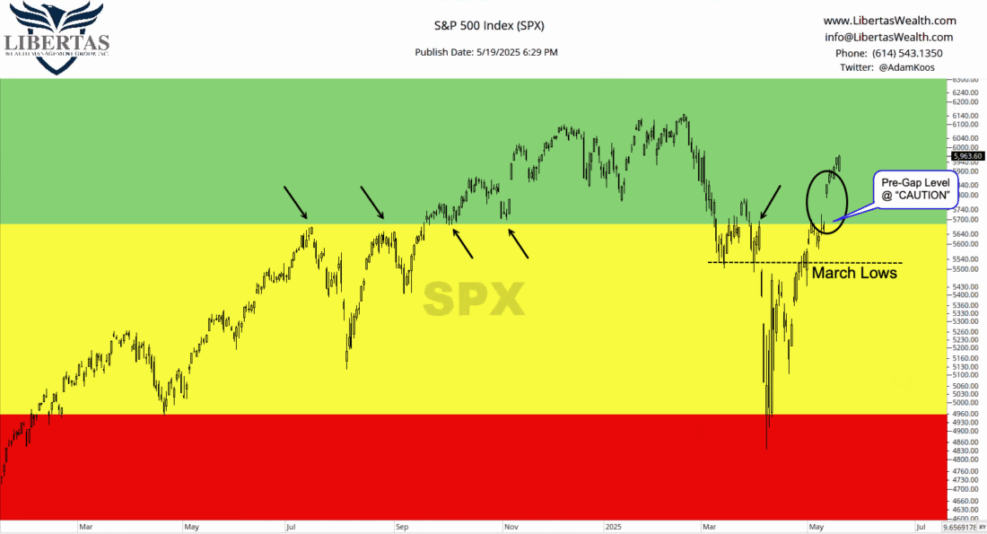
Inverse Traffic Light
I usually wait till the end of the month to create my “Inverse Traffic Light” chart, but it seemed to “fit” today, so here goes nothing…
Similar to moving averages, you can draw horizontal lines of what we technicians call “support” and “resistance.”
Think of “support” as a potential floor below your feet below which, things are expected to get worse. Conversely, think of “resistance” as a potential ceiling over your head, above which, things are expected to get better.
These metaphorical lines-in-the-sand are meant to be plotted at major highs and lows. In other words, we plot these lines at places where either buyers stepped in, took over, and started pushing prices up… or other places where sellers overwhelmed the market and started pushing prices down.
Like anything in life, the more you do it, the better you get, and you’ll be fascinated by how many of these areas tend to relate to one another. Many times, it’s almost like a “market magnet” pulls prices to these lines of potential support and resistance, until they’re broken, and that’s when you really need to pay attention.
Below, in my “Inverse Traffic Light” chart:
The bottom of the GREEN ZONE is marked by the summer ’24 highs, the fall ’24 lows, the pre-Strangulation Day recovery attempt, as well as this past week’s pre-gap price level.
The top of the DANGER ZONE is marked by spring ’24 lows, as well as the Tariff Crash lows.
I also threw in a little “extra” line of potential support at the March ’25 lows, which also happens to be right around the Strangulation Day cascade, a point during which, the market fell -10.5% in 2 days… the 5th-worst two day performance since 1950.
…and if you just can’t get enough of this nerdy stuff, you can read more about that in yesterday’s Investopedia Chart Advisor report by clicking HERE. 😉
—
Originally posted 20th May 2025
Investopedia.com: The comments, opinions and analyses expressed herein are for informational purposes only and should not be considered individual investment advice or recommendations to invest in any security or to adopt any investment strategy. While we believe the information provided herein is reliable, we do not warrant its accuracy or completeness. The views and strategies described on our content may not be suitable for all investors. Because market and economic conditions are subject to rapid change, all comments, opinions and analyses contained within our content are rendered as of the date of the posting and may change without notice. The material is not intended as a complete analysis of every material fact regarding any country, region, market, industry, investment or strategy. This information is intended for US residents only.
Information posted on IBKR Campus that is provided by third-parties does NOT constitute a recommendation that you should contract for the services of that third party. Third-party participants who contribute to IBKR Campus are independent of Interactive Brokers and Interactive Brokers does not make any representations or warranties concerning the services offered, their past or future performance, or the accuracy of the information provided by the third party. Past performance is no guarantee of future results.
This material is from Investopedia and is being posted with its permission. The views expressed in this material are solely those of the author and/or Investopedia and Interactive Brokers is not endorsing or recommending any investment or trading discussed in the material. This material is not and should not be construed as an offer to buy or sell any security. It should not be construed as research or investment advice or a recommendation to buy, sell or hold any security or commodity. This material does not and is not intended to take into account the particular financial conditions, investment objectives or requirements of individual customers. Before acting on this material, you should consider whether it is suitable for your particular circumstances and, as necessary, seek professional advice.
Related Articles


")

Join The Conversation
For specific platform feedback and suggestions, please submit it directly to our team using these instructions.
If you have an account-specific question or concern, please reach out to Client Services.
We encourage you to look through our FAQs before posting. Your question may already be covered!