1/ “Stocks Rise with Fed-Friendly Data”
2/ Maybe Inflation Looks Better
3/ Surely the Job Market is Fine
4/ What Does That Mean for Stocks Then?
Investopedia is partnering with CMT Association on this newsletter. The contents of this newsletter are for informational and educational purposes only, however, and do not constitute investing advice. The guest authors, which may sell research to investors, and may trade or hold positions in securities mentioned herein do not represent the views of CMT Association or Investopedia. Please consult a financial advisor for investment recommendations and services.
1/ “Stocks Rise with Fed-Friendly Data”
I logged into my Bloomberg a little later yesterday and opened up the news page. The first headline I read was “Stocks rise with Fed-friendly data”. Clearly, there must be some good news that is helping stocks because the FOMC has the green light to cut rates in September. The FOMC intimated that things are ‘normalizing’ in the data at the press conference, so if that continues, there is scope to cut.

Source: StayVigilant.Substack.com, Bloomberg
So I go to the data to look at it. As I mentioned earlier this week, I have a strong preference for ISM over other data series. It is coincident and correlated with risky assets, has a long history, and is not revised. I pulled it up and saw that the ISM data continued its fall of the last couple months, going to a less-than-expected 46.8. One can say, ‘The economy is weakening, this is good for the Fed’. However, I would push back that at 45, the ISM is signaling a recession. If the Fed is cutting because we are in recession, that is decidedly NOT good for stocks.
I looked further into the internals of the data. While ISM moves with stocks, the ratio of ISM new orders to ISM inventories actually leads them both. Last year, this ratio was strong, foreshadowing a rising ISM and better stock markets. This year it had been falling until a nice bump last month. Well in this reading, the ratio continued its downward move. The new orders alone were much worse than expected. This is not good news for those thinking the ISM can stay above 45.
2/ Maybe Inflation Looks Better
Maybe the good news the headline referred to comes on the inflation front. After all, if inflation is drifting gently back to the Fed’s 2% target, this also gives them room to cut. I can take solace in GDP (I guess) and think the economy is okay, and if inflation falls, more cuts, and BOOM, stocks rise. Right?

Source: StayVigilant.Substack.com, Bloomberg
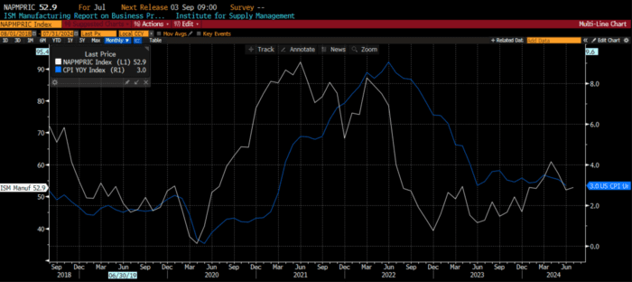
Also embedded within the ISM numbers is the ISM price index. This index itself has leading properties over a measure like CPI inflation, which the market, and consumers, follow closely. When I looked at the ISM prices paid index, I saw that it came in at 52.9, well above the 51.8 expectation. After a nice fall in this measure last month that again gave the market some hope, it is continuing again on its trend higher that began last summer.
We can see that CPI follows ISM prices and not the other way around. Does this suggest that the CPI, which has gone sideways for a year, could continue a move higher? There are many that suggest the ‘seasonals’ in CPI at the end of this year point to a higher CPI already. Does corporate price pressure add to this? Could the Fed be making a mistake with a cut in September?
3/ Surely the Job Market is Fine
There must be some good news within the data though. The headline did say that stocks rise because of Fed-friendly data. I looked at two other bits of data that came out. The first is the continuing jobless claims data that I had written about earlier this week. This data, as well as the initial claims data, was worse than expected once again. It continues its march higher suggesting the unemployment rate will also head higher.

Source: StayVigilant.Substack.com, Bloomberg
Another piece of data within the ISM is the employment data. This is where companies tell you if they are hiring or not. I have inverted this white line in the chart to line it up better with continuing jobless claims in blue and the unemployment rate in orange. As you can see, this data collapsed. It came in at a horrific, recession-ready 43.4 vs. the 49.2 that was expected. This was a massive miss.
The ISM employment, coupled with the continuing claims data, paint an ugly-and-getting-uglier picture of the jobs market. I don’t know what non-farm payrolls will tell us today but we have two other real-time pieces of information that say the job market is not healthy. Given the non-farm payroll number will be revised three times over the next three months, and revisions have been consistently negative for over a year, I am not going to be swayed by the NFP number. The job market is bad. Sure, this gives the Fed scope to cut, but again, if it is cutting because of a recession, this is not good for stocks.
4/ What Does That Mean for Stocks Then?
The last chart shows you why I like the ISM data. I have plotted 30 years of the ISM vs. the SPX year-over-year return. As you can see, there is a very nice fit to the data here. I would characterize these series as being coincident. Neither consistently leads the other. They tend to move together. While the SPX has been moving higher, the ISM was signaling some caution. It continues to do so.

Source: StayVigilant.Substack.com, Bloomberg
More importantly, there was a bit of research put out by Credit Suisse a few years ago. They looked at the returns to the SPX in different phases of the ISM: above 50 and rising, above 50 and falling, below 50 and falling, & below 50 and rising. 50 is the level of expansion/contraction, while empirically, 45 is actually the level of recession. I have drawn a line on this chart at 50 in the data.
The key takeaway is that stocks have positive returns in three of the four phases, with the only phase of negative returns when we are below 50 and falling because that is typically consistent with a recession when you don’t want to own stocks. That is where we are now.
The difficult part for fund managers is that the best time to own stocks is when you are below 50 but rising. That is where we were last year. That is where we were a couple of times early this year. Thus, fund managers have to ask themselves if we go higher next month, so they should buy, or if ISM continues to fall, and they should sell. Given it is the summer, there is a bias to do nothing. However, as we looked at earlier, the new orders to inventories might be suggesting the ISM continues to fall, which means we are in the worst time to own stocks. Look at the disconnect between SPX returns (green) and ISM (blue) above. There could be scope for more downside.
“Stocks rise on Fed-friendly data”. When you dig into the data, I am not sure that is the case at all.
Stay Vigilant!
About This Week’s Author
Rich Excell, CFA, CMT is a 30-year hedge fund and proprietary trading veteran who has lived and worked in Asia and Europe in addition to the United States. He has run investment businesses spanning equities, fixed income, commodities and foreign exchange. Rich is now a Clinical Assistant Professor of Finance at the Gies College of Business, University of Illinois, Urbana-Champaign. He also is the host of the Investment Exchange Forum and Macro Matters podcasts for the CFA Society Chicago and writes a bi-weekly options trading blog ‘Excell with Options’ for the CME Group. Finally, he writes a weekly Substack blog called ‘Stay Vigilant’ which aims to demystifinance for the average investor.
———————————————————-
Originally posted on August 2nd 2024
Disclosure: Investopedia
Investopedia.com: The comments, opinions and analyses expressed herein are for informational purposes only and should not be considered individual investment advice or recommendations to invest in any security or to adopt any investment strategy. While we believe the information provided herein is reliable, we do not warrant its accuracy or completeness. The views and strategies described on our content may not be suitable for all investors. Because market and economic conditions are subject to rapid change, all comments, opinions and analyses contained within our content are rendered as of the date of the posting and may change without notice. The material is not intended as a complete analysis of every material fact regarding any country, region, market, industry, investment or strategy. This information is intended for US residents only.
Disclosure: Interactive Brokers Third Party
Information posted on IBKR Campus that is provided by third-parties does NOT constitute a recommendation that you should contract for the services of that third party. Third-party participants who contribute to IBKR Campus are independent of Interactive Brokers and Interactive Brokers does not make any representations or warranties concerning the services offered, their past or future performance, or the accuracy of the information provided by the third party. Past performance is no guarantee of future results.
This material is from Investopedia and is being posted with its permission. The views expressed in this material are solely those of the author and/or Investopedia and Interactive Brokers is not endorsing or recommending any investment or trading discussed in the material. This material is not and should not be construed as an offer to buy or sell any security. It should not be construed as research or investment advice or a recommendation to buy, sell or hold any security or commodity. This material does not and is not intended to take into account the particular financial conditions, investment objectives or requirements of individual customers. Before acting on this material, you should consider whether it is suitable for your particular circumstances and, as necessary, seek professional advice.


Join The Conversation
For specific platform feedback and suggestions, please submit it directly to our team using these instructions.
If you have an account-specific question or concern, please reach out to Client Services.
We encourage you to look through our FAQs before posting. Your question may already be covered!